EXAMPLES OF GOOD Vs BAD TYPOGRAPHY
This assignment requires you to grab a digital camera and find 5 examples of what you feel is representative of good type use in logos, signage, print layouts, graffiti, car graphics, t-shirts etc. and 5 examples of what you feel is bad typeface use.
Generally, you might expect to find "bad" typeface use in flyers, regional papers, community group newsletters, mechanic workshop signage, etc.
Here are 5 examples of good type:
All of the above type is good and can be read easily.
Here a 5 examples of bad type:
With the blur is makes it hard to focus and read the letters
All of the above are bad type as It can not be read properly.
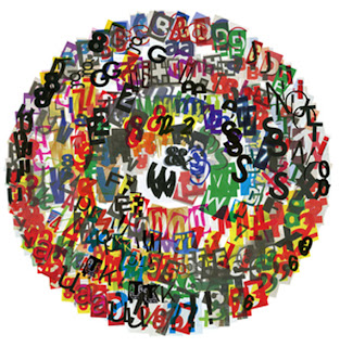
The image above is scattered with letters and jumbled making it hard to read.


No comments:
Post a Comment