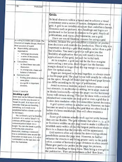
Introduction to grids, layout & flow
The grid system gives unity to your layouts. It allows objects to have some spatial (and hence conceptual) association with each other e.g. body copy is set in columns of equal width and alignment so they all have the same emphasis.
How does it enable unity?
Unity is what happens when a layout achieves a harmonious balance between color, artwork, type and layout. You can tell if there's unity when the focus, hierarchy and flow is obvious and logical and the message is easy to see.
Aligning elements on a page and across pages enables consistency and unity. The grid helps alignment.
Grid lines are used to help position objects on a layout e.g. a 3 column grid offers guides to position columns of text. In addition the horizontal header & footer guides provide a reference that is carried through to the other pages.
The grid system is used for both print pre-press & web publishing. For a single poster with less emphasis placed on unity across pages or chapters, the grid is used to provide alignment between elements. It enables associations to be made between a picture and the text or a logo and a graphic element.
The grid is used across all categories of design; from business card design to packaging, from web sites to broadcast graphics and even architecture.
Do all layouts use grids?
Just about; any media such as page/ web browser/ TV screen/ CD disc label implies a grid by virtue of its framal reference. Already you have a reference for positioning elements.
Why are grids such a regular ordered shape?
The grids are uniform so that the elements adhering to the grid have can have an equal emphasis if necessary such as bodycopy in equal width columns or navigation links in a menu.
Do I have to adhere to a grid for positioning elements?
No. Just like most rules, you can break them if necessary. The Australian Newspaper swaps its grid on a single page from 9 to 5 then to 3 columns.
How can they get away with that?
Bigger publications with a lot of different forms of content may bend the rules by "De-limiting" the grid by using "flow-lines" or "cross-rules"; spaces that range horizontally across the page that isolate the structure enough to introduce a new grid layout. Ultimately however, the grid structure is returned to provide overall publication unity.
Resources:
For a brilliant case-study of designing using a grid see Mark Boulton's article on "Designing with grids" (PDF 8.5MB). This article introduces the CSS Box Model which we'll be using later on in the Web Publishing Module.
It's a "walk-through" of the re-design of Yahoo's web site using a grid system based on a single iPod advert width.
There's an abundance of resources for learning about designing with grids online.
Here's some recommended reading:


No comments:
Post a Comment